HealthyHood
How would you define a ‘healthy neighborhood?" Is it because of the area code? Maybe its because the lawns are green and lush? Or is it the house with the biggest price tag? Many thoughts come to mind when looking for a new place to live. But as anyone knows about packing up your life and relocating to a new city- Moving is stressful!
Millions of Americans move each year- some multiple times a year due to work, family emergencies or just a change of scenery. Imagine an app/website that had everything one would need to relocate with information and convenience?
Description
HealthyHood’s vision is to provide knowledge about the health and wellness of a neighborhood. My goal is to make HealthyHood America’s first choice when browsing the Real Estate Marketplace.
Year
Timeline
Roles
2023
3 months to design mobile app
Research & Analysis, branding, interaction design, visual design, prototyping and usability testing.
Industry
Tech Real Estate Marketplace
I gathered 5 participants who have moved or plan on moving within 6 months time.
Have you moved in the past 2 years? How many times?
When you begin searching, what's the first website/app you think to use? How did you find out about these?
Can you walk me through your process of looking for a place to live?
What filters do you use during your search? (living requirements)
Research Methods
Lets look into it
Interviews (5 ) Participants
Competitive Analysis
Interview Debrief and Discoveries
Why participants were moving: 3 out of 5 wanted to start a family, the other 2 of 5 wanted new opportunities while working remotely.
Indirect needs All 5 needed to be close to grocery stores, good and safe neighbors/neighborhood, and close to parks and freeway to commute.
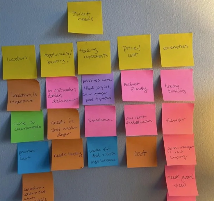
Direct needs All 5 needed location, appliances/heating, price/cost and amenities- pretty standard needs anyone would require.
Pain points All 5 had the same pain point of finding the right neighborhood, only 1 had bid wars, and another participants stress was not having movers help move.
Affinity Map
What do the people need?
It all came down to this: People need more information to influence their decision on what neighborhood they are going to move to. So, I got to thinking:
How might we give a tour of the community for new families thinking of moving to the area?
How might we help individuals find a good neighborhood in a community they are comfortable with? How might we make rating a community easy for new families moving to the area?
Personas
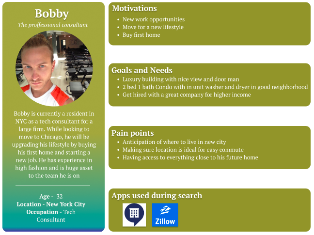
I created the two personas based on my interview results. 3 out of 5 participants were young mothers who wanted to move to raise their kids in a safe neighborhood. Safety was a high priority, as well as location to access indirect needs.
2 of 3 participants were young bachelors who worked remote, and their priorities were drastically different. How? Being a single business professional brings on different responsibilities in comparison to having kids who need a good school, entertainment and a place to meet other kids. For the young bachelors, their main concern was being exposed to new opportunities, nightlife and a fun place to live.
Meet Amanda
Meet Bobby
Designing an app that would be first choice for Amanda and Bobby
Bringing the BIG idea to the small screens
The process of designing HealthyHood was to make it intuitive, approachable and familiar. It’s important for my personas to have access because their lives are constantly on the go, I need to provide elements that flow and make sense without any confusion.
The evolution from these low to mid wireframes went from sketches to digital, however drastically changed in the hi-fidelity frames. I had realized I was putting so much content onto each page- when I was realized less is more.
My branding needed to represent the real estate marketplace, health, knowledge and modern technology. So my logo shows a rooftop with a isoelectric heart beat line- showing an alive and well home. I chose a color palette that catches the eye with teal blues and lush greens, giving comfort and excitement.
After the most recent iterations, HealthyHood showcased a modern aesthetic. Visuals present cities, neighborhoods, properties and local restaurants to provide the user with endless information to fantasize what life could be like in their desired neighborhood and city.
Signing up with HealthyHood begins when users open the app. After signing up, they are brought to the home page and can search for any city. For example, if they’ve searched for Chicago, they are provided with a quick overview of city demographics, what its known for, and a list of trending neighborhoods to choose from.
When a neighborhood is selected to view, the user is able to select different pages to review the neighborhood, info on schools in the area as well as crime, groups of property types and listings, and local restaurants!
What I discovered from my participants was they had an idea about certain neighborhoods, but just didn’t know much about them. So- HealthyHood gives full details on schools in that district for people like Amanda and her young girls. She also wants somewhere safe, and she can see a rating on how safe a neighborhood is. And like most of us do before we buy- we look at reviews.
Most importantly, I wanted to provide convenience. After Amanda feels good about what she’s learned, she is able to check out local real estate and even book a tour with a professional agent with just a few clicks.
Book a Property Tour
Usability Testing
5 participants. Tested 3 task flows on Hi-Fi prototype: Create an Account/log out, Search for a city and book a property tour
Task flow 1: Create an Account/log out needed no changes
Task flow 2: Search for a city had minor changes; change quote on results page to brand logo and add another persona to show more than one success story, add a walking score on property listing
Task 3: Book a property tour- minor addition was to add a phone number of company or listing agent for convenience to discuss with agent instead of submitting a tour request. People like options.
Reflection
HealthyHood is something most of us might be familiar with. But its also something new with all of the insights and answers to many questions we have when we are looking for a new neighborhood to call home.
I personally enjoyed designing this project, especially because during the entire process I myself was looking for a new place to live in my big city of Chicago. After the research segment of this project, the UI design was the most enjoyable for me. Bringing my idea to life and designing wireframes gave me the chance to show off design skills, and polishing the UI made all the hard work worth it. I am proud of this project because people would choose this app first and make moving a lot less stressful.
I faced many challenges like drifting into hours of design that wasn’t necessary, or even needed. Adding so much content to certain pages when really less was more. And time management. From the process I learned that each step of the way is crucial to the finished product, and to take a deep breathe, put on that Harry Potter soundtrack playlist and follow the criteria.
Truly- no product is complete. As time goes on, technology adapts- and so do we designers. I’m sure there will be days, months or years from now I’ll think of some new feature to add to this project or see something and think, “why didn’t I think of that?”
Biggest takeaway I discovered was turn to your team mates, ask your mentor questions and to think out side the box. We have so much to learn from one another and thats the beauty of life- education and knowledge.


