Introducing the epic redesign of
Roscoe’s Tavern
Description
Year
2023
Timeline
1 month to redesign website on both mobile and desktop
Research & Analysis, branding, interaction design, visual design, prototyping and usability testing
Roles
Industry
Food and Beverage Industry
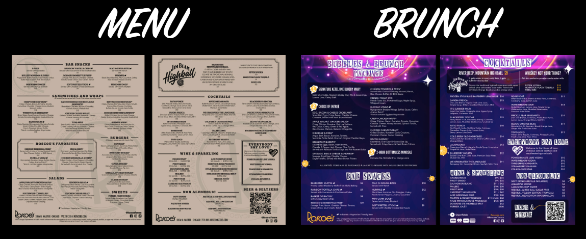
It's a peculiar feeling, stumbling upon an old, forsaken website hiding deep within the realms of the internet. Your curiosity piqued, you gaze at the outdated design, the clunky navigation, and the cringe-inducing color scheme reminiscent of a bygone era. It's a digital relic frozen in time, existing as a testament to the evolution of web design and functionality. That feeling came to me when I searched one of my favorite gay bars here in Chicago, Roscoe’s Tavern. After a gasp and that uncomfortable cringe feeling, I knew I had to take this outdated PDF menu and desolate website into my own hands for a redesign.
In the current day of living in the year 2023, website interfaces, online menus, and information is readily available at our fingertips with sleek design that is nothing but expected from users. Unfortunately Roscoe’s website is not up to par with today's standards and expectations. My job is to make it shine.
As a member of the queer community and a background in online restaurant menus, I have an idea of what the people want and expect from an website & menu. With today's rapidly evolving digital landscape, it is crucial that we embrace ongoing improvement and adaptation to meet the highest standards. I'm solving this problem for this group of users because it’s a well known and iconic gay bar and restaurant that’s a safe space for people from all over the world. Im confident that with this redesign, Roscoe’s Taverns website will be brought back to life.
It’s all in the Details
Research Methods
Interview Participants (3)
Survey
Competitive analysis
First I posted a survey question on Instagram asking “What do you expect when viewing a restaurants website. I then gathered 3 participants for remote interviews that frequently visit restaurants and bars to discover how they find information about them, their expectations/needs, stresses and pain points. A brief look into what questions were asked where:
Say you're looking up a bar in a new city that you're visiting, where would you go first to find information?
When looking online for a food menu, what do you expect to see?
Say you're looking for upcoming events on a bar’s website, what information do you need?
Competitive Analysis
I looked up successful and well-known gay bars and restaurants across America to see what the competition looks like. The five bars I did an analysis on were Sidetrack, Splash, Hamburger Marys, Replay and The Stonewall Inn
Top Competitors
Inviting and bright well organized and on brand
rotating photos and events that look fun
dedicates weekly lineup showcasing nightly events with times and who is hosting
each link has a purpose and is updated daily
Landing page is straight to the point and has rotating upcoming events
drop down menu for dinner and brunch menu which is easy to read
navigation is easy and clean
shows which arcade games are available
dedicates weekly lineup showcasing nightly events with times and who is hosting
Research Debrief and Discoveries
The most important flow for users is the Dining Menu. When Jake has chosen menus, he is able to see the categories of menus. Say goodbye to the sad PDF menu, because now he can see detailed menu item descriptions and pictures.
A properly designed menu makes these kinds of decisions easier and more accurate. A well-designed menu can educate and entertain the customer as well as be a communication, cost control, and marketing tool for the restaurant.
I surprisingly got a great amount of replies stating how important photos are for researching information about a bar and restaurant. Insights discovered from my research were:
All 3 Participants used Google to search for a bars info website
When looking at food menu, Common theme was pictures, cocktail menu, clean organized digital menu with information readily available
When looking at a website, common themes were looking for events, pictures, specials and the vibe of the business
What has been most helpful was an event flier with all info, and list of upcoming events and easy to read
Most frustrating is missing information like date, pop up ads, old outdated links
What do the People Need?
When exploring the realm of webpage design, it becomes evident that certain common themes emerge related to the expectations of an enjoyable experience. Amongst these, two elements stand out: pictures and clear information. The infusion of captivating visuals brings life and vibrancy to a webpage, enticing users to delve deeper into its content. Alongside visuals, the presence of clear and concise information is vital for providing users with clarity and easily digestible content.
I brainstormed POV's and HMW's, this has made me think, "How will I make this redesign more aesthetically pleasing? How can I create a menu that looks clean, easy to read, and with pictures? How can I layout nightly events that give information to the user as fast as possible?”
I created two personas based on my research discoveries. 3 of 3 participants were young members of the queer community and enjoy dining out and socializing with friends. The other survey participants, about 30% of them were amongst an older age group and enjoy dining out, seeing local talent like drag shows and musical show tunes. Keeping different age groups on mind, I created Jake, the young traveling queer DJ and Bryant, the show tunes and foodie socialite!
Meet Jake
Meet Bryant
The Site Map below shows how the new websites navigation will look. The current limited website needs these different pages to provide all the info needed for traveler like Jake and Bryant. Each menu will have its own tab, as well as an Events page showing weekly and annual special occasions.
Site Map & User Flows
Putting roscoes.com in a full drag transformation
After inspecting clean and structured websites as well as our competitors, I sketched wireframes that were visually organized, not cluttered and filled with white space to draw the user eyes to the information they would be looking for, specifically dining menus and nightly events
Sketches & Wireframes for Desktop & Mobile
Mobile Mid-fi Wireframes
Desktop Mid-fi Wireframes
UI Components
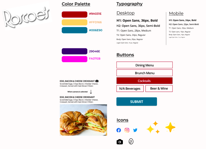
I took the colors from their website and brightened them up to give a more lively and visually appealing palette. I continued using Open Sans- its easy to read and followed their current typography. Most importantly, the newest feature for their dining menu is pictures for food items. For Jake, the option to see the food item makes all the difference in the what he’ll order.
Redesigning a webpage that meets the expectations for Jake and Bryant
Desktop & Mobile Hi-FI Responsive Wireframes Pages
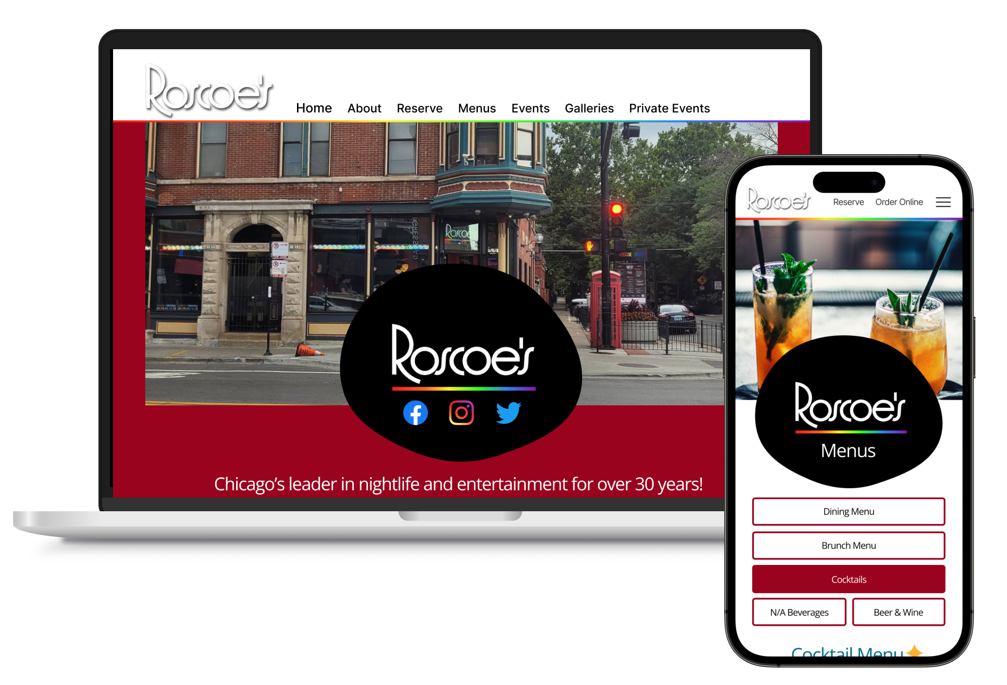
Above is the desktop landing page, giving the viewer what their most likely looking for first- The menus, to reserve a table, and the weekly roster. Second is the dining menu. Instead of a PDF, it is a sleek and modern menu that has a camera icon to view the menu item! The third page is a gallery that viewers can view past events, with the function to choose the year, month and date.
Below shows the mobile pages: on the home page, Jake can select the hamburger menu to see all options to navigate through in a colorful rainbow display. The weekly roster slides every few seconds showing events for each day of the week.
Usability Testing
Tasks:
Navigate through all pages on the menu
View a picture of menu item
Where would you go to find listed weekly events?
If you wanted to inquire about hosting an event, where would you go?
Success Metrics:
Navigation through each page was consistent and flowed easily
Seeing where a user would click/tap on a camera icon would reveal a photo of the menu item
On landing page of the website, users are able to find the listed weekly events with ease including date and time with flyer
If users wanted to inquire on hosting an event at Roscoe's, finding the events tab was easy and had all required info to fill in
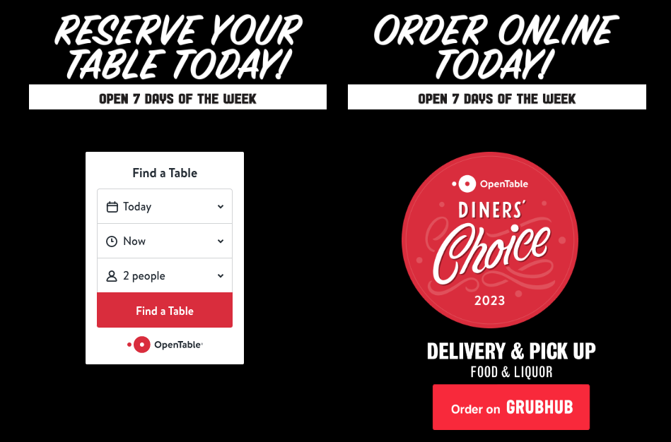
Task flows for this redesign is simple to navigate and execute. Viewing a menu on either desktop or mobile was successful. Making a purchase takes the user to a third party website which flows successfully as well
Reflection
I thoroughly enjoyed bringing this website to life! Through out this experience I was challenged with staying true to Roscoe’s brand and staying on track with time limits and deadlines that I set for myself. In the process I learned what users expect and desire from a digital dining menu. I had an advantage with coming from a service industry background, so I kept in mind how important it is for things to be simple, accessible and consistent for the user. With the skills and knowledge I know now, designing projects in the future can be done smarter and faster than ever before.
I challenged myself to bring a dull, dark and lack luster webpage and dress it up in something lively, colorful and exciting! I feel I beautified this website in drag and they have been changed for the better. Will I show the business owners my work?
Absolutely.
Will they take it on and use it?
Time will tell. But I now have the experience and new skills that will only help me grow to be a better UX/UI Designer!


