Case study · Website redesign · 2023
Roscoe’s Tavern
Bringing an iconic Chicago gay bar’s website back to life, on desktop and mobile.
The problem
A beloved bar hiding behind a PDF menu.
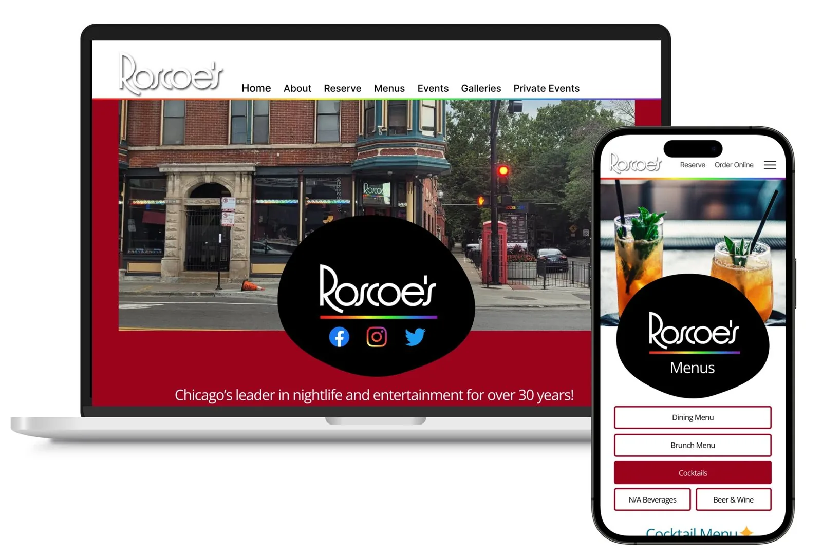
Roscoe’s is an iconic, safe space for people from all over the world, but its website was stuck in another era: clunky navigation, dated colors and menus you had to download.
The solution
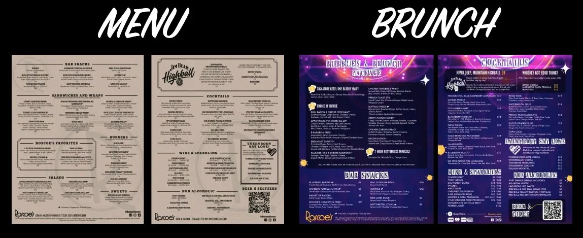
Menus with photos, events up front and a little drag.
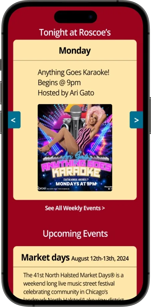
Tonight at Roscoe’s
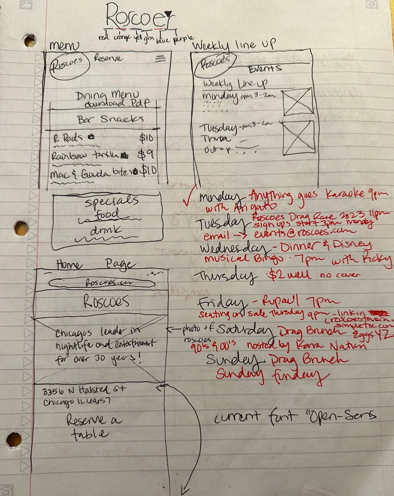
A weekly roster that slides through each night’s events, hosts and times.
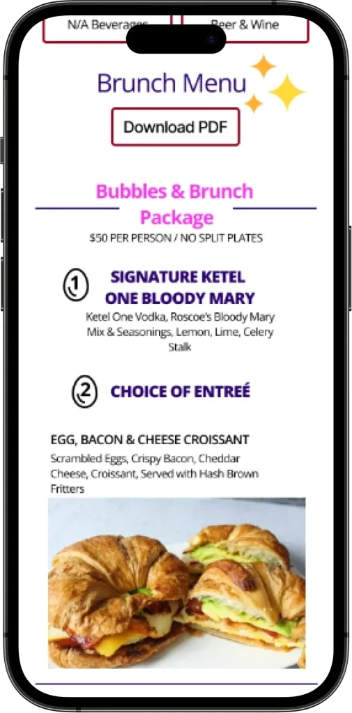
Menus you can see
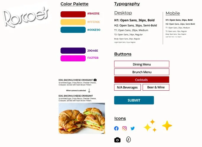
Every dish gets a photo behind a camera icon. No PDF required.
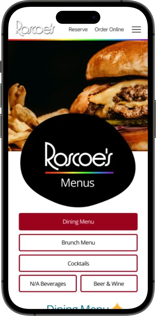
Easy to find
Dining, brunch, cocktails and drinks each get their own tab.
The process
How I got there
An Instagram survey, 3 interviews with regular bar-goers and an analysis of 5 competitor bars.
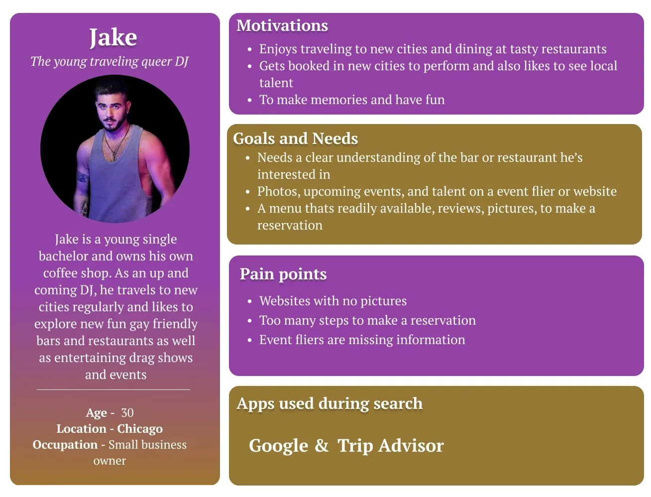
An affinity map, two personas (Jake and Bryant), a new site map and user flows.
Sketches to mid-fi to responsive hi-fi, with Roscoe’s colors brightened and Open Sans kept for readability.
Users navigated every page, opened menu photos, found weekly events and the event inquiry.
Results
Navigation flowed easily on desktop and mobile, and every user found the menu photos and weekly events without help.
A well-designed menu educates and entertains guests, and works as a communication and marketing tool for the restaurant.
Reflection
I took a dull, dark website and dressed it up in something lively and colorful. Will Roscoe’s use it? Time will tell.